PocketBreeze (PB)…Today plugin can also start Calendar Touch (CT)…
Overview
CT works in concert with another product that SBSH offers called PocketBreeze (a PIM management Today Screen plug-in), so you might want to consider getting both of these products (you don’t need PB, but it is pretty cool)… I have to start with a few minor gripes about what I call old-school, PocketPC style applications (and by extension, PB/CT). It’s tough to navigate, much less read tiny menus on a 3-inch screen. Especially ones with a bunch of symbols on them, which is why many newer PIM integration products have ditched the Today screen plug-ins altogether, and opted to use their own non-WM “home” or custom UI with larger fonts and icons. Scrollbars are also practically a thing of the past. That said, it is impressive the way SBSH apps integrate the best aspects of the Windows Mobile OS on the Today screen. If you want to look for a contact, check e-mail, or peruse calendar/tasks--and don’t mind the Today screen in WM--you need to get Pocket Breeze. Calendar Touch is sort of a mixed bag in the “look-n-feel” department, especially when using the various views. The flexibility of a hoard of tweakable options--status quo for SBSH apps--makes up for a lot of the clutter and clunkiness. CT and PB integration amounts to this: Calendar and task items will be opened using CT instead of default PIM apps in WM when selected from the today screen.
Gestures can be used to quickly navigate both apps…
Gestures
CT and PB apps make use of screen gestures. In the case of PB, you can easily navigate between contacts, calendar, documents, alarms and mail by dragging left or right in the today plug-in window (sliding between screens pictured above left). In CT, gestures extend to quickly cycling through dates (a drag and hold towards the right), in addition to forward and backward moves through your calendar. The scrollbars in both apps need to go away, and be replaced by up/down gestures, in my opinion.
Installation
I installed CT via cab file since that’s how it was provided for the beta. The application is about 1.5MB, and since it doesn’t incorporate a great deal of fancy graphics (save for a few animations), it started up instantly and without issue on my iPAQ. There were a few forum entries indicating problems with it starting up. I would recommend un-installing any previous apps (from SBSH) that do calendar integration and also removing any settings that may have been stored as well. During install, CT gives you the option to embed it as the default calendar viewing application (the option I went with). I really can’t see much purpose in even giving a choice here. I mean if I’m going to buy a program that does everything the default apps do and more, wouldn’t I want it to replace them? Anyway, you can also select a left or right soft-key to assign CT to during the installation, conveniently giving you one-touch calendar/task access.
Using CT
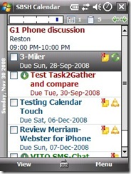
When you first open CT, the default user interface presents a combined list of tasks, and appointments. That’s probably it’s greatest strength right there…and maybe it’s greatest weakness. Wait, I admit it’s pretty cool to have them all together, but tasks always show up on today’s date, and there’s is no simple way to show/hide tasks from the main interface (you have to dig into the settings). If you have a long list, better yank out your stylus, cuz you got some scrollin to do. The appointments will bubble to the top, so at least they aren’t in the way. SBSH has a horizontal day timeline that displays on the top left of the screen (see below). It gives a graphical representation of your schedule. Also indicated are the number of appointments and tasks, along with L/R tap symbols for moving between dates (in case you don’t like using gestures). It might be a nice enhancement to add the ability to turn on/off tasks or appointments by tapping the icons in the top menubar.
Working with Views
Task, weekly, and monthly views…
So you don’t like your calendar view, eh? Well, why don’t you change it. Like the default WM time manager apps, SBSH gives you a choice of daily, weekly, monthly views as you would expect, however, the views have interesting and useful ways of presenting a lot more data to you than you will get in the default applications built into the WM OS. You can also go to a list view of your tasks. There is a trifle that the default WM calendar has that Cal Touch does not (or maybe I just didn’t find the option for it). A yearly view, which I find is quite useful for a checking far flung dates. The monthly calendar view is especially well done when presented in horizontal mode. It combines the best of all the available views, IMHO. You can read appointment and task details for the day as well as navigate the entire monthly calendar. You can tap on a day (or navigate using the D-pad), and an expanded bubble window of that day is displayed. A subsequent tap, will drill you through to the daily view. The left soft-key will then be assigned to take you neatly back to the monthly view. Tap-n-hold on the daily view (or use the menu soft-key) to add either a new task or appointment.
Adding Appointments/Tasks
New Appt and Task., Date/Time select windows, and Field Editing Options
Adding an appointment or task is not that far removed from doing so in Windows Mobile standard apps. Several fields appear (although in an animated fashion in CT), and you either select from pre-defined text entries, or enter custom text. The date and time pickers are large button versions to allow the easy, quicker navigation of using fingers. You also have the option to insert “My Text” entries depending on the field type (Home, work, etc.), or even contacts into fields, and add or customize the list entries themselves. After entering the required data, your new appointment will show in the calendar view you have selected (see below):
New appointment added with note, is confidential in nature (the lock) and a reminder set…
Settings
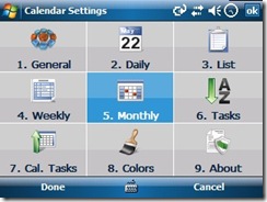
Select the Menu soft-key and then Settings…
This is my very least favorite thing to review in SBSH applications, because just about everything in their applications can be tweaked. It can be both a blessing and a curse, because the tweaks are not always what I would consider to be intuitive. At any rate, you can customize just about every view I’ve mentioned in this review in some manner. You can tweak text size, colors, and turn on/off way too many features to list here, unfortunately. I think they should simplify this or simply trim down the tweakability factor a bit.
Conclusion
Anyone who has read a number of my reviews probably knows that I give no free passes. I am fair and impartial to all vendors alike. I like SBSH applications in particular, but I try to be generally positive about most vendor products I review. Constructive criticism is a good thing, after all, and helps to identify areas where a product could use a little fine-tuning. Because I point out a few minor tweaks in an application should not be construed as an overall thumbs down or up. In the case of CT, I give it a general thumbs up, but would like to see them bring the complexity down a notch, unify the gestures better, and get rid of the pesky scrollbars. The date/time picker while better than standard, could also use an automated scrolling features (I hate to say it, but much like iPhone). For the sake of brevity, I left off several more great features that this application has over using the default WM apps. Features like search and and custom filtering that are nice to have, but maybe not that important to the average calendar user. You can learn more, download and check it out for yourself here. CT is $24.95, but our VIP members know that they can get a 15% discount until 31 December 2008 on CT and similar apps. Just hit the VIP link at the top right corner of our page.


No comments:
Post a Comment