
This is a continuation of a several part article on using your handheld for forecasting the weather. See the original post here to get the links and previous background information...
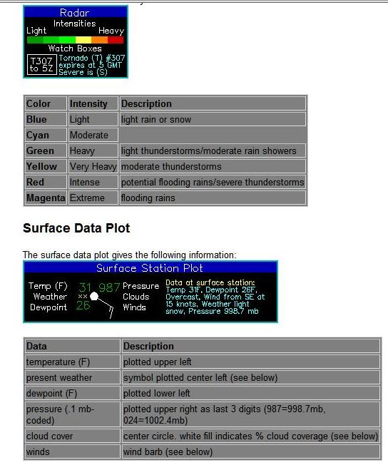
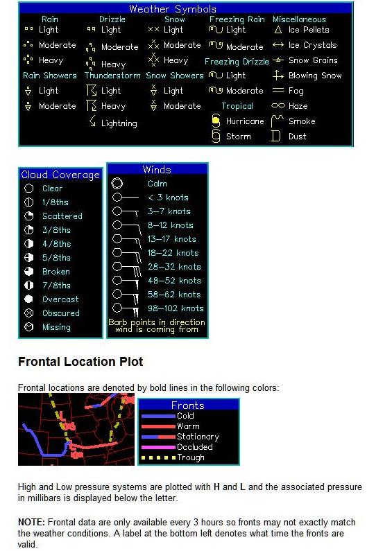
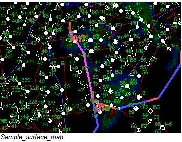
The same principles apply for the surface analysis as in the previously discussed upper-air products, except the pressure values are typically reported in millibars or inches of mercury (MB, or Hg), and are corrected to mean sea-level pressure (or MSLP) so that surface stations at different locations can be standardized. This is the typical values regurgitated in TV, and local media reports. Remember that all definitions and measures for wind, temperature, pressure and humidity can be easily looked up on wikipedia.com or similar online resource. Let’s look again at a surface (SFC for short) analysis and the keys for that level as well:
Surface charts and upper air charts look a little different in a chart package and rightly so. We have so far focused on the 500mb level in the upper levels, but it’s very important for the weather professional to take note of the patterns revealed for all the significant levels, because each might indicate slightly different clues to the dynamics that are occurring in the atmosphere over a region, and taken together reveal an approximate 3-D representation. After a full analysis of all the significant levels in a surface and upper-air package, the forecaster will begin to understand the current state of the structure over the region.
500MB Example with my edits to indicate a Trof, and the upper level flow pattern
The following are basic features to look for on the charts in a classic mid-latitude migratory weather pattern (loosely defined as one where the polar front jet is steering the migratory systems through your area):
Tight Cyclonic Wind Turning: At all levels in the northern hemispheric troposphere, counter-clockwise turning (especially sharp turning or deflection over a short distance) is an easy way to spot organized low pressure weather systems in the atmosphere. In strong cyclones or organized low pressure areas, this will be pronounced up through the 300mb layer. These systems typically stack well through the layers at all levels over a region and will be evident on each chart, tending to stack vertically back towards the colder air behind a surface cold front and just behind the surface low. See previous chart..
Anti-Cyclonic Wind Turning: High pressure, while somewhat more diffuse in organization is similarly located by looking for an organized clockwise turning in the winds, usually following somewhere behind the previously mentioned cyclonic area…Basically the inverse of the flow pattern you see above…
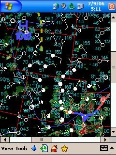
SFC analysis with my edits (re-analysis of the fronts, Low, and wind pattern)
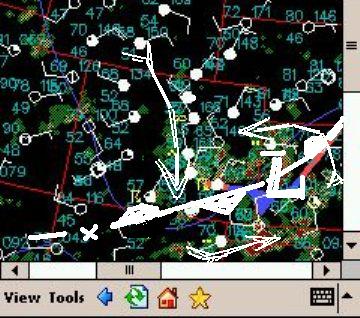
Low and High pressure centers, ridges, or troughs: Usually indicated by a cluster of strongly curved isobars or isoheights (which are what we call the lines on the map). Think of a vortex in the wind patterns mentioned previously. Winds typically point out of a high and in toward a low, and so it translates that a closed off circle of low pressure would be a center of rotation and represent the lowest pressure or least dense air in the vortical column rising up from surface, a high would characterize the opposite. At the SFC, highs typically follow a cold front, the front being basically a trough of low pressure formed out ahead of the super dense cold air behind the front. The frontal systems will usually be rotating around a closed-off low somewhere out ahead of the following high pressure. A warm front will usually be found out ahead of a low also rotating around the center (slower than the cold front, which is how an occluded front forms). These frontal systems not only rotate around the low center, but they also translate in horizontal distance in relation to the movement of it. In the upper levels, a closed off pressure center may or may not be evident, but a trough or ridge most likely is evident following just behind the surface feature.
Areas of High Humidity, weather, radar echos: Some charts show you lines of equal RH (the percentage of moisture content based on Temp/Dpt ratio), some dew-point and some indicate dew-point depression (DPD, which is simply the value of the temperature and dew point spread). Low-level charts at 700mb (10000ft) and below indicating moisture content in the air mass in question are among the most useful in determining the overall weather effects produced by a system. For instance a cold/dry trough of low pressure may pass through your area with little weather effect other than some windy surface conditions, but moves downstream and is able to draw substantial amounts of moisture from a large body of water, and turns into a blizzard for the next locale. Strong cyclones will have a consistently high moisture content throughout the stack. Many surface analysis products will be an amalgam of plots with actual weather, and radar data indicated as shown above. Satellite pictures are also a very important tool for noting the moisture distribution over a region.
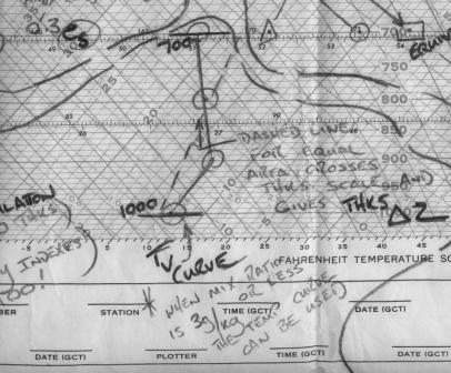
Hot and Cold pockets: Represented in isotherms. The temperature profile can be the most problematic element for determining an accurate forecast, and is best if considered in relation to the actual moisture content. Temperature can vary or change rapidly in an airmass, and is probably the single most important factor in determining the outcome of a given scenario, as it is often the single modifier for all other parameters. A strong, cold airmass that starts out over Canada moving south is already warming up from below and being modified and therefore it’s other native properties (pressure, and humidity) will also change. As with the previously mentioned dry cold front scenario, an airmass temperature can change considerably when passing over a large moisture source. A common practice is to use the upper levels and surface charts in similar practice as with the pressure analysis to search for pockets or centers of cold or hot air (or in their absence a cold trough or warm ridge), but for the consideration of temperature advection (horizontal movement of a colder or warmer air mass), it is often better to use an indicator called Thickness. Thickness is a representation of virtual temperature of a layer of air (say from 1000mb-700mb) over a region. It is essentially the temperature at which a dry air parcel equals a moist parcel at the same pressure…Now look what you did! Caused me to lapse into weather-speak! Oh the horror!. Ok, let me try a formula:
Tv=T + w/6 where Tv is virtual temperature, T is Temperature, w=mixing ratio in g/kg, divided by 6
I told you this weather stuff was easy…
The thickness is not as hard as it sounds. Think of it this way, you want to divide up the atmospheric temperature profile between the surface and 700mb level considering an average temperature for the layer. Add to that the mean actual moisture content (which is basically what mixing ratio is) for the averaged temperature layer. Using the skew-t diagram we can take that value, and apply it to an empirical scale for that layer (1000-700) which gives us our thickness calculation. Still not clear, huh? See an example below, and note the intersecting line drawn across an equal area of the temperature profile:
Don’t freak out over thickness, as we’ll apply how to use it when we get to using the model forecast products.
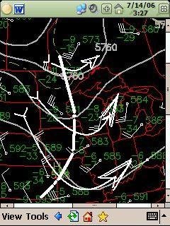
Now, we finally get to the vertical sounding plots, which come in some different flavors as well. See a screenshot below for a preview of the next installment:
No comments:
Post a Comment